Best Interior Paint Colors for Dark North-Facing Rooms in Vancouver WA Homes
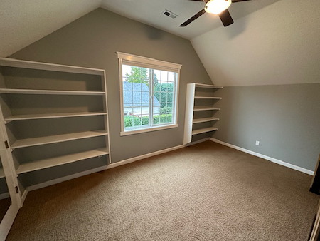
North-facing rooms in Vancouver, WA often feel cool and dim, especially from October through early spring. If your living room, bedroom, or home office leans north, the right palette can shift the space from shadowy to welcoming. This guide breaks down light reflective value, undertones, and local light so you can feel confident choosing colors. If you want a pro to handle color and finish selection along with the painting, talk with our team about interior painting that’s tailored to Pacific Northwest light.
Why North-Facing Rooms Feel Dark in the Pacific Northwest
Our region’s bright gray sky softens contrast and cools color. Evergreen trees add a green cast, and shorter winter days mean fewer peak-light hours. In neighborhoods from Felida and Salmon Creek to Cascade Park and Fisher’s Landing East, these factors make pale, cool whites look flat or even dingy.
- North light is cooler and bluer, which pulls blue or gray undertones forward.
- Overcast skies diffuse contrast, so low-saturation colors can look lifeless.
- Tree cover in Vancouver and Camas can add a green tint that changes how colors read.
How To Choose Paint Colors That Lift Low Light
Two ideas do the heavy lifting: undertone and LRV. Undertone is the warmth or coolness hiding in a color. LRV, or light reflective value, is how much light a color bounces back. North rooms usually look best with gentle warmth and enough reflectivity to keep shadows from taking over.
- Favor soft warm undertones: cream, beige, greige, or muted clay. These counter cool north light.
- Look for a moderate to higher LRV so the room doesn’t feel heavy. Always confirm the LRV on the manufacturer’s swatch or site.
- Choose finishes that fit the surface and look you want. A fine matte or low-sheen eggshell keeps walls calm while reflecting a touch more light than dead-flat paints.
- Trim that is slightly lighter and cleaner than the walls helps edges stay crisp in cloudy light.
Color Families That Work In Vancouver, WA North-Facing Rooms
Warm Whites and Creams
Think creamy off-whites with a hint of yellow or beige. These tones reflect light without turning stark blue. They suit spaces with oak or warm-toned floors and play nicely with wood trim that’s common in older Vancouver homes. Crisp, gallery-pure whites can look cold here, so choose whites with a touch of warmth for a soft, calm feel.
Greiges and Soft Taupes
Greige marries gray and beige, which is a win in cool light. The beige adds warmth while the gray keeps things modern. Greiges with subtle green can go dull in tree-filtered light, so lean to options with a gentle peach, yellow, or even violet-beige undertone to keep balance. These colors shine in open-plan spaces from Salmon Creek to East Vancouver where you want continuity across rooms.
Muted Greens, Blue-Greens, and Dusty Blues
Nature-inspired hues feel at home in the Pacific Northwest. But in north rooms, pick softer, slightly warmed versions. A muted sage, blue-green, or smoky blue with a touch of gray can look restful, not chilly. Pair with creamy trim to keep edges bright on gray days.
Benjamin Moore vs Sherwin-Williams For PNW Homes
Both brands offer excellent low-light choices with reliable color systems, durable finishes, and wide sampling. Benjamin Moore tends to offer nuanced neutrals and historic tones that read beautifully in our soft daylight. Sherwin-Williams carries approachable, builder-loved neutrals and a deep cabinet of warm whites that resist going icy under Vancouver skies. Local paint specialists can help you match sheen and product lines to your space. Many Pacific Northwest crews, including Fletcher Painting Co., Inc., also work with regional favorites when they best suit the home’s surfaces and light.
Using LRV Without Getting Lost In The Numbers
LRV is a helpful guide, not a rule. In a north-facing room, ultra-bright whites can glare at midday yet still look flat by evening. Mid-to-lighter colors with warmth usually feel more consistent from breakfast to bedtime. When you’re close on two colors, choose the option with the undertone that flatters your floors, counters, and fabrics, even if its LRV is a touch lower. Color harmony beats the number on the back of the chip.
Trim, Ceilings, and Sheen That Support Your Wall Color
Set the frame for the wall color to do its job. Slightly brighter trim keeps details visible when the sky is gray. If your ceilings are low or the room is small, a lighter ceiling in a consistent sheen helps lift the space. For busy family rooms and hallways, a scrubbable wall finish protects the look you picked and avoids the chalky haze that can dull color over time. When our crews plan interior painting, we coordinate wall, trim, and ceiling finishes so they age together and still look fresh next winter.
Neighborhood-by-Neighborhood: What Works Around Vancouver and Camas
In Felida and Salmon Creek, tall firs can cast a cool green light into north rooms. Warm creams and greiges with a faint red-beige undertone fight the green shift and keep skin tones natural. In Camas, hillside shade and river breezes cool rooms even on bright days. Muted blue-greens with a creamy trim feel calm without reading cold. For mid-century ranches in central Vancouver, a soft taupe on the walls with slightly brighter white on baseboards keeps lines clean and the space relaxed.
Love exterior color harmony too? Our recent article on pairing bolder details and body colors can spark ideas that echo inside and out. See the simple rules in choosing exterior accent colors that compliment Portland architecture and borrow the same balance indoors for doors, built-ins, and mantels.
Climate Considerations: Why Prep and Timing Still Matter
Paint only looks as good as the surface below it. North rooms can hide scuffs and drywall seams until the new color goes on, so proper prep makes a visible difference. Professional planning also respects our wet seasons and interior humidity. For a bigger-picture look at how pros schedule and protect finishes around here, skim our exterior painting checklist for rainy Portland and SW Washington weather and imagine those moisture-smart habits applied indoors too.
Putting It All Together Without Guesswork
Here is a simple way to move forward. Start with your room’s fixed elements: flooring, stone, tile, and big furniture. Choose a warm-leaning neutral that flatters those surfaces under cool light. Add a supporting trim color that is lighter and cleaner. Then consider an accent on built-ins or a single wall in a slightly deeper version of your main color. If you want a direct route, schedule a professional color consult and ask for two to three palettes that fit your light, style, and maintenance needs.
For homeowners comparing providers, you can always return to home base. If you want to learn more about our services and color approach, begin with interior painting in Vancouver, WA and see how we tailor products and prep to local homes and weather.